I often confuse of contentPresenter with styles and controltemplate. Now i found the difference. To understand ContentPresenter we need to be clear on controls classification and how it works in Silverlight, so hold your breath.
There are two choices or types of controls that we can create.
- Controls which are extended from System.Windows.Controls.Control. There are many controls of this type. These are normal controls which can be templated by ControlTemplate. Eg:- TextBox, DatePicker, DataGrid
- Controls which are extended from System.Windows.Controls.ContentControl. There are few controls of this type. These are called as content controls & expose a special property by name Content. These are also templated by ControlTemplate. This namespace is a sub namespace of the above namespace Eg:- TextBox, DatePicker, DataGrid.
| Note: UserControl is one exception. Even though it not extended from Contentcontrol name space hierarchy it has Content Property. we cannot controlTemplate the UserControl |
Content Property of the control
The main difference we can finally arrive is Content Property. How can we use this property efficiently? Let's define it
"Content Property expects anything of type's string, object, date time or another control itself".
One interesting this is it can be set with another control content. Controls can be simple a tooltip, button or composite controls like stack panel, Grid or user control. This can be used to change what a Button displays on them like background image or to change what a tooltip displays apart from normal text.
userControl1.Content=Usercontrol2.Content
Let's take an example of Button and create button that uses Content and ControlTemplate. The image below contains two Buttons first one using the control template and Second one using Content. First one doesn't look like a button because Control template removes all the default styles like mouse over, click effects, more on how control template behaves is out of context. Lets examine XML of the two buttons to know more differences.

If you see the second button you can set Content property to a composite control without losingbutton default styles. But the first button it loses all the styles. Similarly you can set programmatically
XAML Buttons |
<Button Height="200" HorizontalContentAlignment="Left" > <Button.Template> <ControlTemplate> <Border BorderThickness="1" BorderBrush="Black"> <StackPanel Orientation="Vertical"> <Image Source="Mahesh_Email.JPG" /> <TextBlock Text="Using ControlTemplate Property"/> </StackPanel> </Border> </ControlTemplate> </Button.Template> </Button> <Button Height="200" HorizontalContentAlignment="Left" > <Button.Content> <StackPanel Orientation="Vertical"> <Image Source="Mahesh_Email.JPG" /> <TextBlock Text="Using Content Property" /> </StackPanel> </Button.Content> </Button> |
ContentPresenter
Sometimes you need to use the ControlTemplate of a control to change the look and feel of the control. Like change the appearence how a textbox, ToolTip renders. Similarly If the end-user sets the content property value, we might want to render the content with different styles on the control. This is where ControlPresenter is helpful. There are some rules for usage of it.
- You are defining the style of the control.
- You want to use the ControlTemplate to re-define the Styles of the control
- Control should be a control extended from ContentControl which mean it should have Content Property
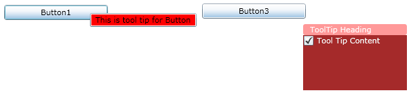
- Tooltip on the first button is displayed with a default behavior some applied color styles.
- Tooltip on the second buttons uses a controltemplate and in it we use contentPresentor to render composite Control which looks like it. I have used check box to render on the control. You can add any controls similarly on the contentcontrol.
The XML Used

No comments:
Post a Comment